Higher Ground by
Tull Suwannakit
Author/illustrator Interview at PaperbarkWords
“There was no one. Just us.
‘Never lose hope,’ Grandma said.
‘Life can be meaningful even in the darkest of days.’ “
(Higher Ground)
New Frontier Publishing
Thank you for speaking to ‘Joy in Books’ at PaperbarkWords, Tull.
You must be thrilled with the final version of Higher Ground.
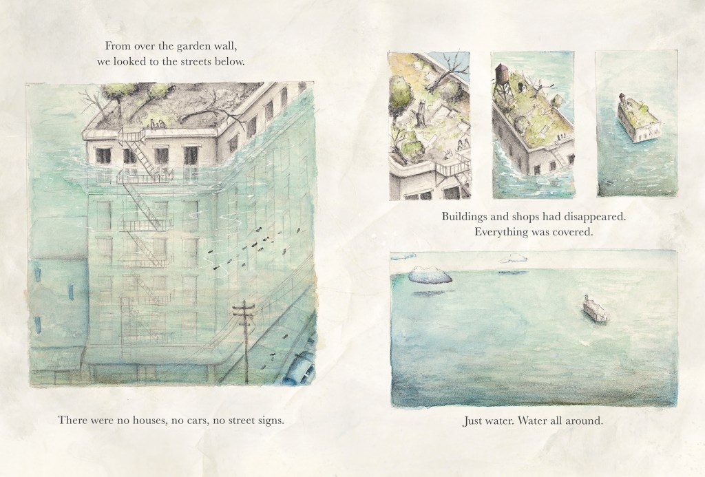
You tell an important story primarily through visual storytelling. It is a sweeping yet gentle, intimate tale. I poured over your illustrations, sensorily experiencing the seasons passing and reacting viscerally to the rising water. You show climate change through flood yet give children hope through the survival skills that their grandmother teaches them, and agency through their growing capacity to help others.
The book is beautifully produced and will have great application in schools or as a gift.
Which of your earlier books paves the way for Higher Ground – either thematically, technically or in another way?
In many ways, I have always been drawn to the notions of home, family values, resourcefulness and adaptation. This is seen in my previous books such as Happy Hoppy Home and Downtown Sewertown. In both stories, the characters work together to overcome their obstacles to find that “silver lining”. However, they were told in a more simplified narrative, targeting a much younger audience. But nonetheless, they hold crucial ingredients in the developing of Higher Ground. Using characters that are non-native or considered to be an outsider (Hares from Happy Hoppy Home, vermin from Downtown Sewertown) or with underrepresented background (protagonists from Higher Ground) are seen in most of my work as well.
What is the significance of your title, Higher Ground, and why have you chosen to focus on flood rather than another natural or other disaster?
The one thing that I feel so empowered about is overcoming the fear of water. When I was a child, I used to be petrified of water. Maybe it was because I nearly drowned when I was young. Swimming lessons were a nightmare for me and I would spend many years trying to overcome that fear. Yet, I was always intrigued by the magical wonder of water, the essence of life. I found a deeper connection with it. Water to me, feels poetically versatile. It is soft, quiet, cleansing and powerful all at the same time. My story is about hope, growth, courage and overcoming obstacles in the face of adversity. The title gives an uplifting and positive energy that to me, is very spiritual, intimate and personal. It gives a sense of hope and strength, rising above the troubles.
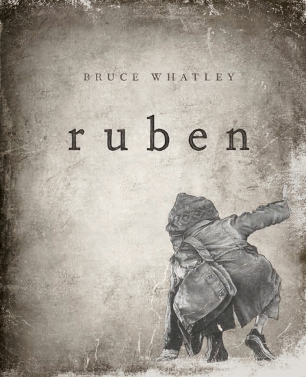
Higher Ground’s illustrations and graphic novel elements remind me of Ruben by Bruce Whatley, The Afternoon Treehouse by Robert Ingpen and the endpapers of The Arrival by Shaun Tan. What works do you believe may have influenced you?
I am glad you brought these works from these astounding authors up, as I hold great respect for them dearly. To be honest, during my research, these three masters were among my top influences. I have always been fascinated by The Arrival’s monochromatic sepia illustrations, which evokes the notion of old and vintage and is pivotal for the mood and tone for Higher Ground. I love the “slow burn” pacing of Ruben, in which the narrative develops slowly, allowing readers to feel an emotional connection with the characters as the story progressed. Other books that influenced me in terms of narrative and theme include, Walden by Henry David Thoreau, The Pilgrim at Tinker Creek by Annie Dillard, The Stubborn Light of Things by Melissa Harrison and Consolations by David Whyte.
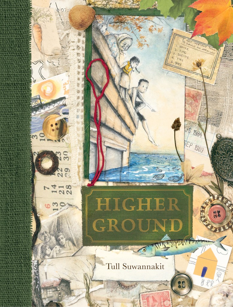
Please share something about the ephemera on the book’s cover with us.
The cover was put together using traditional methods of collage work. The items used for the cover resonate with the story in terms of the change of seasons, transitory and fragments of memories as they passed through time. With that in mind, dandelions were collected on my walk around my hillside home, pressed in the book, before using it as part of the collage. I think that there is something quite transient about the life cycle of a dandelion. You witness it flowering for a few days then close. With a gentle breeze, the seeds inside the closed head disperse and repeat its cycle again. Maple leaves from different seasons collected and then digitised to preserve their luscious green and orange hues, before becoming brittle and dried on the end page. My son contributed by eating an apricot and leaving me with the pit. The reference of an apricot pit also suggests renewal and growth. The calendar indicates time, the year on the library card 1989, was the year that I was sent to a boarding school.
How do you show the bond (and respect for the elderly) between the family members?
Although the time spent with my family has always been brief as I was sent to a boarding school in Singapore at a young age of nine for over a decade (1989-1999), before attending my BFA degree and work in The US (1999-2007), then migrated to Australia from 2010-present, family time with my parents and relatives has been quite transitory throughout my life, but I was taught at a young age to always respect the elders. Let the elders eat first, always ask for permission before eating the last piece of food on the plate, helping with the chores around the house (I learned to cook for myself and others at the age of ten) and in my family, eating together has always been a big thing to show the bond. You can go out with friends and hang out but you have to come home for dinner or have dinner before having a night out with friends. It is the one written rule in our house when it comes to family bond.
Why a rabbit?
I feel that the use of a white rabbit creates a link between reality (domesticated/garden/home) with the fantasy elements seen in the story (flooded city/fishes inhabiting the apartment buildings) and almost evoking the white rabbit seen in Alice in Wonderland. It gives the story an added level of magic, beauty and a dream-like feel. On a spiritual level, in some cultures, I think that a white rabbit serves as a spiritual guide, coaxing and pointing the characters toward new beginnings. In Chinese tradition, a white rabbit symbolises beauty, elegance and mercy, all of which are important for my story, which deftly moves through the seasons connecting readers to both the harshness of our environment and the beauty of the cycle of life. It is a story of courage and hope and I find the use of a rabbit to be most effective.

I really appreciate your depiction of (and guide to) sustainable living. Which, if any, of these do you use or implement personally?
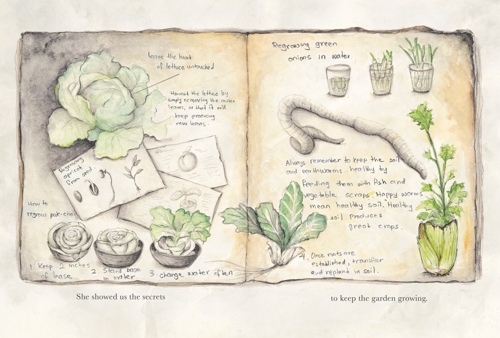
I learned a great deal from my grandma when I was little on how to preserve and conserve foods through sun drying, pickling and canning of fruits and vegetables. I remember clearly back in the days when persimmons were scarce in Thailand and were needed to be imported all the way from China. It was our most precious fruit that only came by once in every full moon. And when a small box of persimmons arrived, my grandma would let us only have some of them while still fresh and replanted the seeds (which was never quite successful). The rest, she would dry them in the sun and turn them into dried persimmons that could last for the next year or so. It has been a tradition in our family. For Higher Ground, we decided to change it to apricots for readers to easily identify with.
During lockdown, I began adapting a simpler lifestyle and a more sustainable practice. My son and I would re-grow stalks from leafy green vegetables, by placing them in water until the roots began to appear, then planting them in soil in order to have a new harvest over the coming months. Harvesting from the outer leaves of lettuce was a good practice as well, and a single lettuce could feed us for up to a month, before the lettuce’s heart eventually stopped producing new leaves and died. Then we just replanted a new one and repeated the process. But I guess, that is the beauty of it all, the cycle of life.
In the book, the characters used every part of the fish, so that nothing would go to waste. Similarly, when my son and I get a whole chicken from the supermarket, nothing would go to waste (unless we are going to roast the whole chicken). We rendered off-cut fats and skin into lard. Scraped meat off the bones and chicken frame, ground up and made into chicken patties. Bones turned into stock. We also ground up used bone into powder and fed the plants.
You tell the story in short poignant chapters. Why do you write using very short sentences?
The use of sparse text and prose captures the mood and tone of the narrative. It creates a quiet, isolated and spatial environment for the characters. The simplistic and colloquial narrative further creates a realistic sense of diary like entries coming from the point of view from an eight-year-old child. Lastly, this method of simplified writing aids readers with learning differences, as well as allowing younger readers to be able to read it with greater ease.
Why are there no page numbers in the book? Whose idea was that?
To make it feel more like an actual diary-like journal, almost as if it has been created by the protagonist and is now passed on to us and invites us to be a part of the story. The last few pages of the book are left blank, not a white stock card, but rather a textured paper similar to the internals of the story, almost waiting for us to add to the entries. I find it to be interactive this way.
Where and why have you used wordless pages?
The entire chapter seen in Chapter 9: Days Gone By has no words at all. I find that wordless pages are important in juxtaposition with the rest of the book because it gives a sense of a time lapse, where we see the characters grow, age and change over an unspecified period of time. It allows the readers to closely analyse the minute details of the changes seen in the characters without the interference of the words. I find it to be quite a powerful and intimate element to rely on the visual alone without any words to take away from the narrative.
How do you use panels to show time passing?
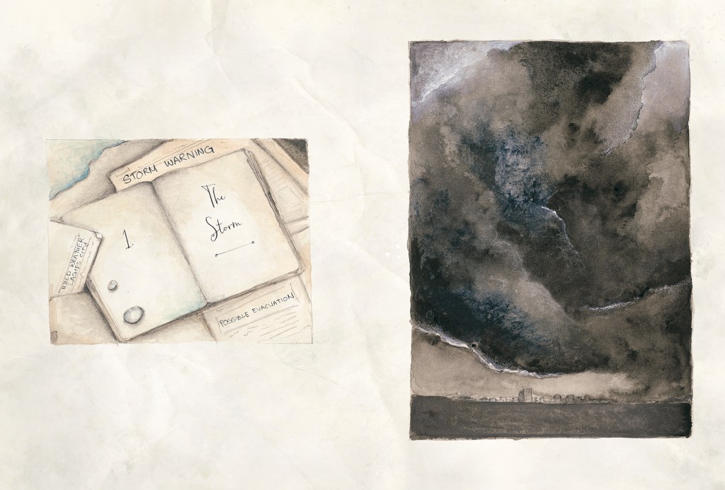
Chapter 2: The Flood, where the story reads, “But help never came. Days turned into weeks. Weeks into months”, is where we see the note on the roof gradually faded away and replaced by the overgrown grass. If you look at the position of the shadows in each of the panel, you will also notice the passing of time.
Chapter 6: Life Goes On, each day, as the boy marked the water level on the side of the building wall, the water level increased bit by bit on each of the panels, again indicating the notion of time.
Finally on Chapter 9: Days Gone By, various panels were used to depict a sequential age progression of each character as they get older. Hair grows longer, facial features changed and change in posture from upright to hunch indicates fragility and old age. The increment in the number of tally marks on the cabin wall also indicates time.
Where and why are you particularly pleased with your use of perspective or a bird’s eye (or other) view?
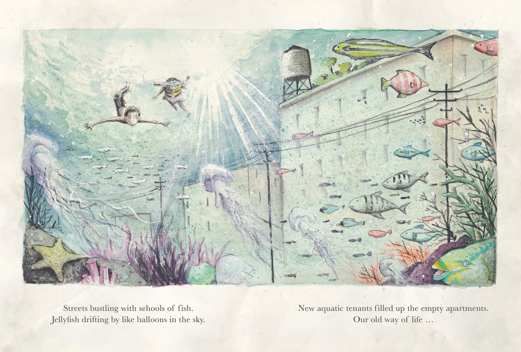
I am especially pleased with the ant’s eye view of the underwater viewpoint, where we are almost part of the school of fish looking up to the two characters sitting on the edge of the building (We caught glimpses of the world below the water’s surface and streets bustling with schools of fish scenes). They feel magical and peaceful, a sheer contrast between dystopian and utopian.
Why have you used watercolour, graphite powder, gouache and acrylic paints? What is it about one or more of these that makes your illustrations so evocative?
The combination of various mediums allows not only the freedom to express both the visual and emotional aspect of the scenes, but also gives each of the illustrations different contrasting levels according to my preference. For instance, the sepia watercolour wash and grey lead shading give the scene a field journal like feel, while the added application of water-soluble graphite powder helps mute down the scene, giving it a dystopian look (Chater 3 Lesson Learnt “Everyday, Grandma taught my sister and me all that she knew”. The ocean scenes in chapter 12: Lost, needed deep and intense pigmentation to convey the rough stormy sea and hence, the inclusion of gouache and acrylic paints effectively captured the stark contrast between light and dark, almost like a theatrical chiaroscuro depiction. I think that each medium has its own uniqueness; watercolour has the ability to create brightness and optimistic scenes, while graphite powder and acrylic paints are able to achieve bleakness and intensity-filled dramatic scenes. By using them interchangeably or collectively, allowed me to create evocative illustration in ways that I intended.
I’ve recently been reading about monochrome and the grisaille technique. Is that a technique that you have used in Higher Ground? If so, how have you used it here?
It’s funny because I never thought about that technique on a conscious level. But yes, it is something that I adopted especially for this project, in which very light layers of sepia tones are added on top of each other, being very careful to keep each layer as transparent as possible. Once I was able to achieve a desired tonal value of light and dark (about 4-5 washes), I would work on deeper shade of dark brown and black for shadows. This creates an impressionistic vignette look that is personal and intimate.
How have you used colour?
For many scenes that required additional shades of colours, I would add them on top of the monochromatic layer in order to help give the scenes an added luminosity and vibrance before applying the deep shadows of black and dark brown. The colour palette has to be quite limited as well in order to maintain a consistency of the overall vintage look of the book. Colours that make the scene stand out are red and yellow, shades of green and blue.
Blue represents water and green are used for vegetation and plants.
As well as the final double-page spread, I was particularly affected by two illustrations: ‘At night, the sea lit up with a soft, shimmering glow. It was magical.’ (Chapter 7: The City) and ‘… from luscious green to crimson, orange, yellow and gold.’ (Chapter 8: Harvest Moon) Could you explain why one or both illustrations might have such a visceral impact?
The first scene is almost pitch black and only lightly illuminated by the bonfire and the glow coming from bioluminescence of the marine organisms. Something that is filled with magical wonder, uplifting and optimism amidst the stark contrast of the darkness that surrounds the scene, almost ready to swallow it up, but yet the glow seems to put darkness at bay and gives the characters a moment of spiritual and personal growth. I envisioned Harvest Moon to be the starting of the chance of seasons, the passing of time and the cycle of life. It suggests that nothing lasts forever, the wonder of life is a transient thing that we should cherish every moment of it.
I see this scene as reminder of how far the characters have come. As the chapter implies, Harvest Moon is a time of reflection, abundance and gratitude. I find it to be very self-reflecting and a deeper connection of life and solace.
The words and ideas behind, ‘struggle, solace, acceptance, new beginnings and hope’ in your Acknowledgements are powerful. Which illustration in the book embodies one or more of these qualities?
The page that indicates “After dinner, we listened to Grandma’s stories”. This scene to me sums up everything about the book’s underlying themes. It depicts a European starling with a broken wing that suggests the notion of struggle. A little girl (which to me, is Grandma as a child) took care of it, before releasing it back to the flock, which signifies new beginnings and hope.
What do you hope young readers take away from your book?
The story’s central themes of survival and hope resonate strongly in today’s world, where children are increasingly exposed to global challenges like climate change and environmental disasters. It’s a timely story of hope, courage and growth that teaches readers the importance of family values and the appreciation of life through nature. It’s a book that encourages us to cherish every little moment in life and to find that silver lining in time of need. I believe these are lessons that will help shape a better, more empathetic future. My aim with this new book is to encourage young readers be more sustainable and make conscious decisions on the world around them.
Higher Ground at New Frontier Publishing
Downtown Sewertown by Tull Suwannakit reviewed by Joy Lawn for Books + Publishing
