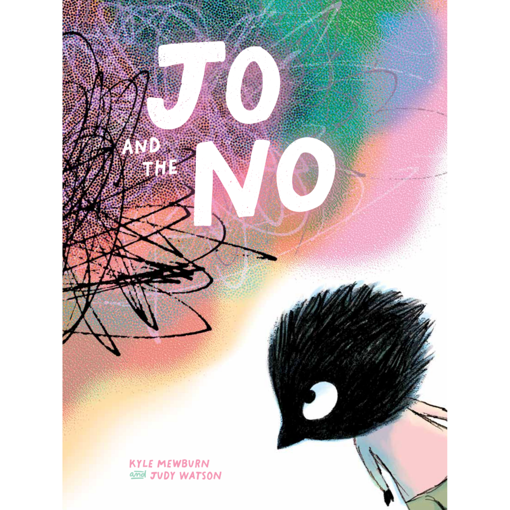
JO and the NO
by Kyle Mewburn
Illustrated by Judy Watson
Published by Dirt Lane Press, WestWords
Credit to Judy Watson for the images used in this interview
Inside the CBCA Notables
Inside the CBCA 2026 Notable Books
‘Jo took a deep breath.
Then stood up
And held out a hand.
“Come on, NO. Let’s go,” said Jo.”
(JO and the NO)
Interview with Judy Watson about JO and the NO
Congratulations to you and Kyle on JO and the NO being CBCA Notable Book, Judy. It is a profound, imaginative picture book.
Thank you for speaking to PaperbarkWords blog.
You have given us a masterclass in picture book illustration here that will be enlightening and invaluable for students and educators.
How have you and Kyle Mewburn turned the abstract concept of ‘NO’ into this exemplary picture book, JO and the NO?
Thanks so much for having me on the blog, Joy! I’m so glad you like our book.
What is the NO? Ultimately the interpretation is up to the reader, and it will be many things to different people. Later on, I’ll talk about some of the NOs that I faced while illustrating the book.
As I began working on it, I could see that the NO had a broad scope and could mean many things, so I approached it loosely. I loved Emma Bowd’s description. She defined the NO as ‘The concept of self-limiting thoughts and their consequences on how we live our life’.
In illustrative terms, I had to consider first whether the NO is a thing that comes from outside or inside Jo. My feeling is that many of these self-limiting thoughts originate outside us, often very early in life. We are told outright rules, or we pick up subtle social cues that urge us to always colour inside the lines; to become other people’s idea of what we should be.
But later we internalise those thoughts and start self-correcting and limiting ourselves. Eventually we can find ourselves trapped in a set of complex social rules, and it can feel as though we have no personal choice. But it’s good to remind ourselves that we do have choice, and that’s what this book is about.
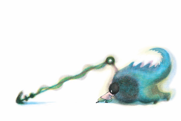
In practical terms, working out how to illustrate the NO was tricky! It had to be immensely heavy and intractable, but also amorphous, fast moving and a shape-changer. (Our self-talk is very clever at adapting on the fly to stop us from doing things.)
The NO went through many iterations, until I experimented with layering several colours and textures on top of each other, including halftone dots. The dots suggested the formless nature of the NO, and the misregistered edges of the several layers suggested a shimmer of shape-shifting. I was then able to make a very solid, heavy-looking shape but still make it look as though it could change at any moment.
Your characters are very human-looking, yet they are animals. Why animals? Please tell us about some of them.
There are a few reasons for the animals. The main one is that universal experiences like the ones we explore in Jo and the NO, resonate with fewer people if we use a specific human character to stand in for all of us. I often refer people to Scott McCloud when talking about this. He explains in ‘Understanding Comics’ how people can relate better to a face that’s merely two dots and a line than they can to a detailed drawing of a person with a specific gender, ethnicity, age, set of physical characteristics and clothing style. The more detail… the less we relate to the character, because every detail makes them less like us. But two dots and a line can be all of us.

(Or two lines and a dot)

Simplified, anthropomorphic animals work well this way, because they can express human thoughts and feelings eloquently, without being a specific human. We seem to pop ourselves into their skin without batting an eye. They’re very relatable.
Perhaps too, they can express big emotions like anger and frustration without being censured by readers. Would adults respond negatively (even if only subconsciously) to a picture of a real child in a rage? Whereas we seem to be hard-wired to sympathise with a big-eyed baby animal, even when it’s behaving badly.
Another reason animals commonly stand in for children in books is that we don’t feel comfortable depicting children in danger. I’ve been asked to put thongs on a child character’s feet when they were barefoot outdoors. Suspending a child by a rope over a jagged glass abyss with a giant octopus creature hanging underneath them is perhaps a stretch. And this brings us to the internal logic of the story. In a world where there are ‘glittering towers of glass’ and giant, shape-changing NOs whose sole purpose is to obstruct someone’s path, we need to look outside the obvious for a hero.
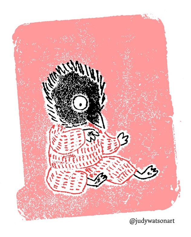
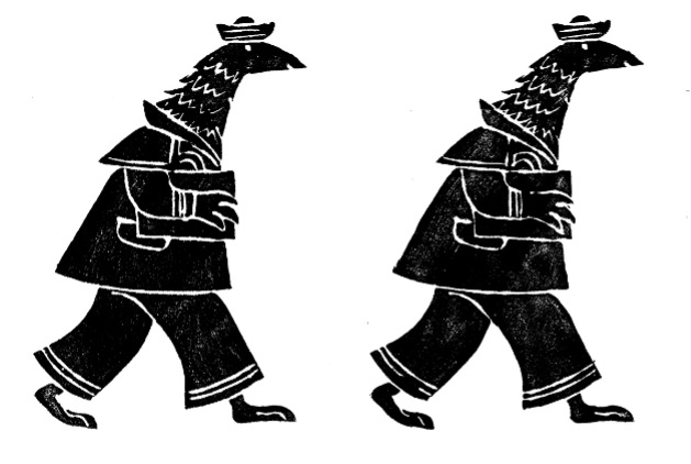
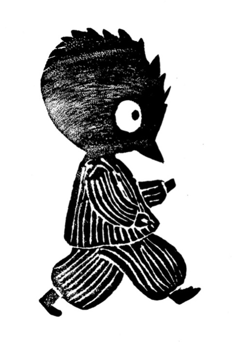
But there’s another reason for the animals. I’ve been drawing birds in hats and dogs in coats for years. It’s just a thing I do. And when Margrete Lamond approached me about the book, I asked her if she had any particular style of mine that she preferred. One of my experiments she pointed to was a ‘pyjama bird’ character, as I called him. Jo evolved from the pyjama bird and didn’t change very much. She also selected a few other foam printed animal characters that you can see here.
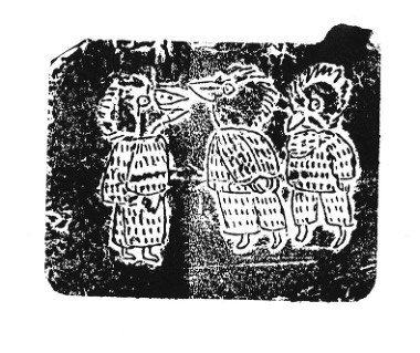
The first two pyjama birds, printed from margarine container foil lids.
How have you illustrated characters using different styles? (Some on the title page and in the park, for starters, seem deliberately ‘faded’ and I’m very interested in the technique you have used to create them. Suggestion of batik perhaps?)
Yes, you’re right. They’re deliberately faded. They’re foam prints, made with a very simple technique anyone can do at home. You can use ‘scratch foam’ https://camartech.com.au/product/scratch-foam-pk-10/ and scratch into it with a wooden skewer or ballpoint to etch a line, then apply paint to the surface with a roller or brush and print onto paper. This scratch foam can give you a medium-fine line when you draw into it, but it’s not particularly cheap. Cheaper, is the craft foam you can buy anywhere. You can use it the same way, except that it won’t work with a skewer. A skewer will tear it. You’ll need a ballpoint or similar, and you won’t get such a fine line. But it works!
In my case, I then scanned the prints and recoloured them in PhotoShop. But they have a nice rough look to them, and because they can’t take much detail, they force me to use broad strokes to create my characters. This way I surprise myself, instead of drawing the same thing over and over by habit.
I found they were really great for background characters. I wanted them to be quirky and intriguing, but not intrusive. They represent a rich, diverse and friendly community in Jo’s world. On the title page spread, I faded them back so that Jo was framed in the crowd, clearly the star of the show in the opening sequence, but still part of a community.
Usually, I take several prints and choose my favourite. This is a sailor on his way from the docks to a meeting. I’ve written microfiction stories about several of the characters.
I did try Jo out as a foam print, but it didn’t allow for enough subtlety in Jo’s facial expression, so I decided it didn’t work for the main character, and ultimately a simple graphite pencil was best for Jo.
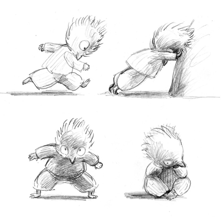
Above is a foam print test (that still appears on the mock-up for the cover design on some websites) and some early character development sketches.
I used pencil for several of the other characters too, and in some cases the original rough sketches were used in the book. This had always been a big NO in previous book projects. The NO had originally come from outside. There’s usually an expectation from publishers that the roughs will be redrawn and tidied up for final art, but over time I had internalised it, so that even when I was given almost total creative freedom to do whatever I wanted for this project, I found myself trapped with this internal NO. I was just too scared to use the original drawing, even though I liked it exactly as is. Eventually I worked through this the long way. I re-drew the characters, and coloured them, placed them in the illustrations and compared the result with the original roughs. In some cases, I removed the redrawn versions and reinstated the sketches, finally happy that they were the better ones.
It was such a freeing experience to finally unshackle myself from the need to redraw a perfectly good rough with a tighter, often less charismatic final art version.
Likewise, the very idea of using different media for different characters in the same book was initially a terrifying NO. What would people think? And would it even work? Publisher, Margrete Lamond, was very hands-off with the decision making. My questions were answered with ‘Do whatever you like, as long as it has its own logic.’ So I had to find my own courage, and I’m glad I did.
What symbols have you used in the illustrations? How have you used them?
The NO itself is the most significant symbol, as we’ve discussed. The pink flower at the start is a symbol of innocence, joy and freedom of spirit. When Jo meets the NO and becomes suddenly aware that there are (seeming) limitations to what Jo can do, the flower is crushed. The fact that Jo kindly offers the flower to the NO is symbolic of child-like innocence and sets up both characters for the reader. The NO’s response illustrates very clearly without the use of words, that the NO is not a friend. What else it is, remains to be seen.
I used the seasons loosely to symbolise the stages of Jo’s personal growth and the passage of time during Jo’s period of emotional stasis – the green shoot emerges at the point when Jo has decided to face their fear and not let it hold them back anymore. After that point they are working hard towards achieving a freedom of spirit again. And they do reach it, but by then they’re no longer an innocent. Instead, it’s the freedom that comes with wisdom and self-knowledge. The final pages are naturally filled with flowers to celebrate this. Jo has come full circle to the scene on the half title page, but it’s an improved version – Jo is with friends.
This brings us to the symbolism around community and isolation. Because when we give in to our NOs, it’s often at the expense of human connection and being a part of things. The social isolation can be especially severe if the NO is a very big one. Jo is part of a thriving, diverse community at the very beginning, but then becomes very isolated as they are consumed by living with a NO. At the end, when Jo has done the work, understood their NO and left it behind, Jo returns joyfully to the world of people. We never know what Jo’s NO is.
How have you created movement in the story?
As with all Western picture books, part of whose purpose is to teach literacy to children, the movement goes from left to right, in harmony with the turning of the pages. This is always fun when I can use weather and natural elements to literally bend the action to my will!
In this case the movement was particularly important because Jo’s progress is a metaphor for the hard emotional labour that Jo is doing. So, although Jo is moving from left to right, the elements are pushing Jo back. For example, on the whispering fields page, the wind goes from right to left, bending the grasses in the opposite direction from Jo’s progress.
On the windswept seas spread, the waves are taking Jo along at a cracking pace from left to right. Jo is actually feeling quite exhilarated by this point and is reassuring the NO. Through this entire section, we’re illustrating ‘feel the fear but do it anyway’.
But if you look at what I call the ‘stasis’ pages (before Jo starts the journey) you’ll see that a lack of movement is just as important. Jo is going nowhere – is absolutely stuck and is governed by and ‘protected’ by fears. Life is literally passing Jo by. The NO is depicted as an immovable object, very upright or rooted to the ground. By contrast, other people are moving. They’re getting on with the sometimes uncomfortable, rich experience of living. Jo is missing out.
I love your generous patterned multiple-endpapers. Please tell us how you created them.
The endpapers are many layers of halftone dots overlaid in PhotoShop. I made a lot of these, because they’re intoxicating to me. And the designer picked from the collection I sent her, but I do have favourites.
Halftone dots were developed as a 20th Century printing technique to print photos or gradients using limited ink colours. They employ a pattern of dots of varied sizes to trick the eye into seeing a smooth graduation of tone. These days they look a bit retro, because they remind us of comic books and old advertising images, and now we can create them using filters or brushes in digital applications like PhotoShop. Below you can see an example of a radial gradient on the left, and how it would look when converted to a colour halftone pattern on the right. But that’s not how I usually use halftone.
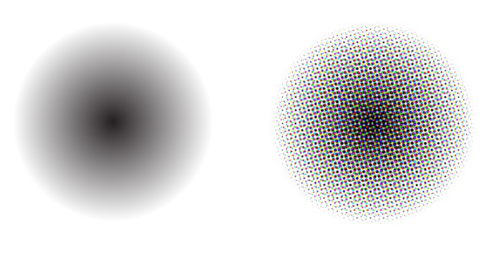
I use halftone brushes, applying them in a more intuitive way, layering up colours – closer to the way I paint with a physical brush. I also use a plug-in tool called Stipplebot to create other stippled effects. There’s a strong thread through much of my work that is obsessed with speckles, flecks and criss-crossing irregular texture. Outside, when I look at grasses and leaves moving in the light, shifting shadows, the sparkle of light on rippled water, the scatter of leaf litter and soil, I see a world of speckles.
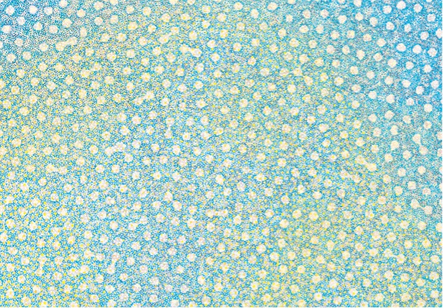
As endpapers, they’re intentionally ambiguous. They might be the NO. They might be a field of flowers. Maybe they’re just decorative. But they fit because the halftone dots are a theme running through the whole book.
Please tell us about one or more of the colours you’ve chosen.
Jo wears pink and olive – pink is such a bright, uplifting colour that responds beautifully when used with other colours. I particularly love it with green. But it also carries a sense of vulnerability since it became a symbol of femininity in Western culture at the beginning of the 20th Century. And it’s become associated with hearts and love as well. Jo is an innocent – a heart laid bare – at the beginning of this story. So, it makes sense for Jo to wear pink. The rest of the book uses Jo’s signature pink and olive as a theme for Jo’s personal journey and also tips a little nod to mid-century children’s books with overlaid and deliberately misregistered layers of cyan, magenta, yellow and black.
I had a little rough guide at the top of my layout board, to keep me on track in case I wandered off into Colour La-la Land. And remembering to leave lots of white space was really important to me. For this book I didn’t want readers to get too distracted by background details. I wanted their eyes on the emotional journey.

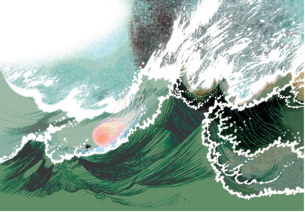
Is your illustration of the “windswept seas” inspired by another artist? If so, please elaborate. (Am I seeing a Japanese influence here and elsewhere?)
You’re not the first person to see a Japanese influence in this book. And who wouldn’t be influenced by Katsushika Hokusai’s The Great Wave off Kanagawa when illustrating a wave at sea? It’s so perfectly a wave and yet isn’t attempting to be realistic. But the influence was largely subconscious in this case. I was certainly attempting to capture the steep asymmetrical composition that Hokusai’s work achieves so well, because it unsettles the viewer and makes them feel vaguely unsafe.
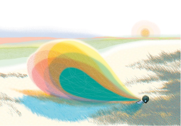
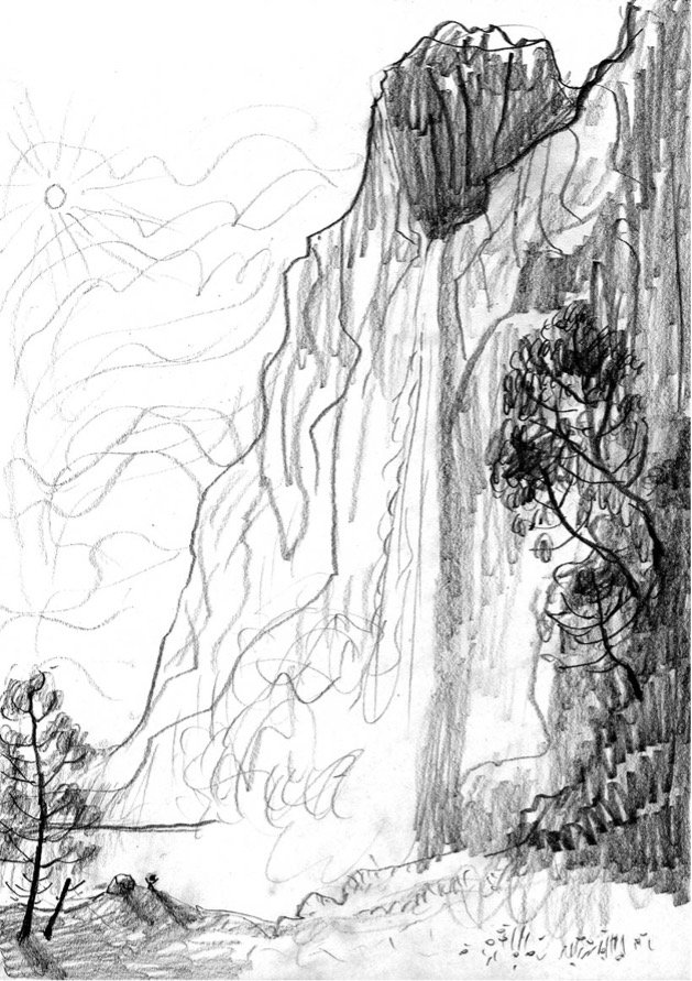
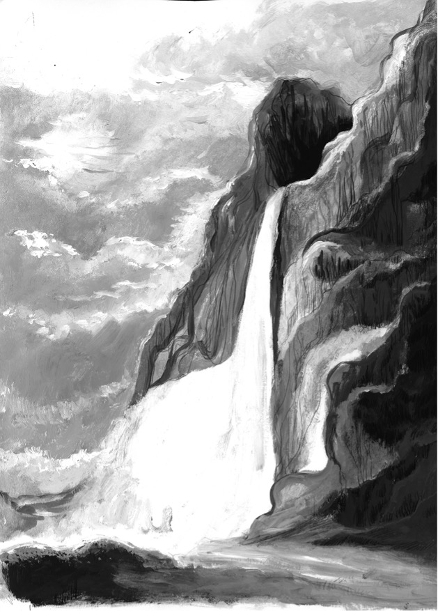
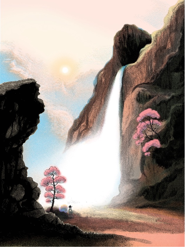
However, there is one illustration that makes a very deliberate reference to a specific painting tradition. Margrete Lamond and I were discussing how the climactic moment of the book was to be depicted – the part where the NO begins to crack. My thinking was that Jo is initially concentrating all their efforts on just moving forward, with the dragging weight of the NO holding them back. Hence Jo is still somewhat inward looking. But as the journey continues and Jo experiences more of the beauty of the world, the sheer wonder of life takes Jo out of themself, until the NO diminishes and is finally revealed to be nothing.
The moment when Jo becomes completely unconscious of the NO, has to be something simply breathtaking to Jo. And it had to top all the spreads before it, which was a bit of a tall order. I suggested a waterfall and Margrete said Ok but make it very big, and Jo very small. Have a look at the Hudson River painters’ work. So that’s what I did. It was a lot of fun actually. And of course, it’s a ‘sun breaking through the clouds’ moment too, so it’s laden with symbolism. I wanted it to glow.
I sketched a few options, tested it out as a pencil drawing and a painting, then layered it up, and added colour and texture in PhotoShop to make it shimmer. I even tried it with a stag at the top of the cliff, which was a very Hudson River thing to do. But the stag was distracting from Jo and the NO. So, he had to go, poor lad.
Of which illustration in this book are you most proud? Why?
Interesting question! I’m proud of different things in different illustrations.
I was happy with the way I was able to demonstrate Jo’s changing feelings in the interaction with the NO in the early ‘white’ spreads of the book. I had a blast with the Hudson River waterfall, and had never done anything like that before. I was immensely relieved when the Towers of Glass illustration finally came together after 31 gigabytes worth of work!
I love how the mirror lake illustration turned out, with hand-drawn elements, Rorschach style paint blot mountains, a collaged punt, the drift of stipple in the sky that might be bugs or bats or distant birds in flight and a cheeky visual pun with the NO looking at itself in the lake in a moment of ‘self reflection’.
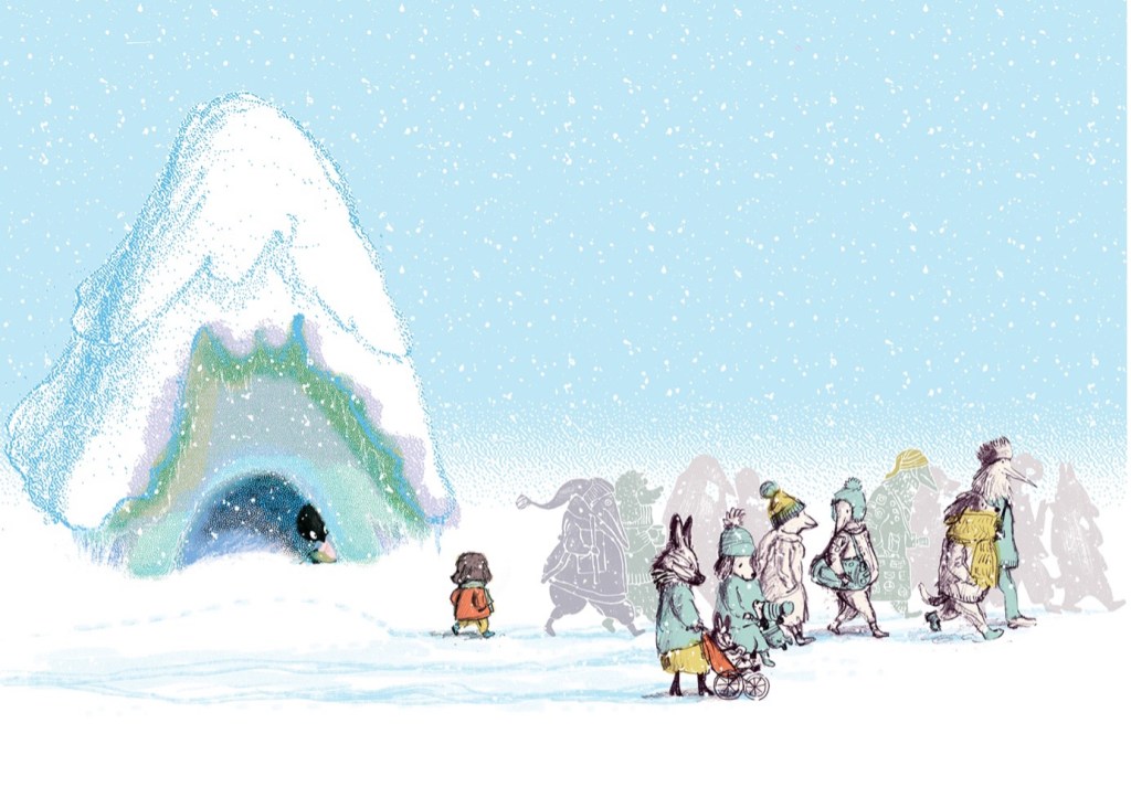
I think my favourite is the ‘rain and snow’ spread. It communicates everything I wanted it to, and I feel that all of the tools I employed work really well here. It has the cameo characters representing life passing Jo by, and all of the pencil drawn ones are the original roughs, including the original rough colour blocks on scarves and hats. I’m so pleased with that wonkiness. It has the foam printed characters – some with features, some in silhouette as they recede into the background. They’re mixed with the pencil characters, and it works. It has limited colour, and the colour scheme is restful to the eye, like softly falling snow. The Stipplebot delivered perfectly for the background blue fading into white in a frosty way. The cool colour layers on the NO, and the fine edges of dots make it look really icy, but somehow a little cosy. Most important of all for me, is the subtle interaction between the passing child and Jo. It represents a whole lot of communication and leads us naturally into the next spread when Jo is finally ready to make a move.
Quiz time! Can you spot the fake foam print character/s and the real foam print character/s in this illustration? (By ‘fake’, I mean it was drawn in PhotoShop using my drawing tablet.)
There are, of course, illustrations I’d tweak if I could. But they will remain a secret. Shhhh.
Congratulation on JO and the NO being names a CBCA Notable. What was your reaction? How did you celebrate?
I was so happy to find out it was on the Notable list! I was pretty sure that it wouldn’t be a Notable, because although it had some really lovely early reviews it seemed to disappear after that, and it isn’t in many bookshops.
On the actual evening, I had been out all day with friends (sewing!) and I had completely forgotten about the announcement. I was watching a movie with my husband and when my phone dinged a couple of times, I didn’t even look at it. I read the messages when we paused the movie to get hot chocolate. My publisher Michael Campbell, and friend Natashia Curtin had both texted me to say Jo and the NO was a Notable. Huzzah!
What do you think is the greatest value of this book for young readers?
The greatest value of the book for young readers? As well as enjoying Jo’s adventure, hopefully readers can tease out the meaning and find it empowering. If they’ve been passed over for the netball team a couple of times, that doesn’t mean netball has to be a NO for them. Do they struggle with reading? A future writing career doesn’t have to be a NO. Scared to speak up in class? Do it anyway. In fact, don’t stop there. Why not try out for the school play? But I do think it’s a book for all ages. An illustrator friend told me it resonated strongly with her, because at one time she felt trapped and unhappy in her job, and a change of career felt overwhelmingly too hard. It was just a NO. It’s great to remind yourself that in many cases a NO is just… nothing. at. all.
Anything you’d like to add?
I will just add that not all NOs are nothing. And I’m not talking about unhealthy risk-taking. That’s not what this book is about. Some kids will be carrying NOs around that are deep and scary and dangerous. Their NO might be speaking up and seeking help.
When the book first came out, I started working out some fun classroom activities around students writing their NOs down and hiding them inside paper clay creatures which perhaps could be disposed of in some cathartic way, but I realised this wouldn’t work. Some NOs are too personal to risk exposure in a classroom setting. (But you might like to try this idea at home on your own!)
So, my final comment is ‘Handle other people’s NOs with care’!
Oh, and here’s the quiz answer:

Thank you for an outstanding interview, Judy. We can see why your work is so lauded.
Congratulation again to you and Kyle.
Jo and the No at Dirt Lane Press/WestWords
Judy Watson about When You’re Older written by Sophie Laguna at Paperbark Words
Judy Watson and Lesley Gibbs about Searching for Cicadas at Paperbark Words
Hazel’s Treehouse by Zanni Louise and Judy Watson at Paperbark Words

2 thoughts on “Jo and the No Interview with Judy Watson”