Timeless by Kelly Canby
(Fremantle Press)

Inside the CBCA Shortlist
Inside the 2024 CBCA Shortlist
Timeless is the WINNER of the CBCA 2024 Picture Book of the Year category.
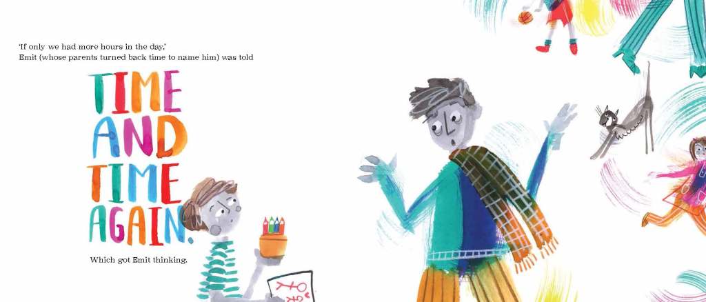
“ ‘If only we had more hours in the day,’ Emit (whose parents turned back time to name him) was told TIME AND TIME AGAIN. Which got Emit thinking.” (Timeless)
Author/Illustrator Interview: Kelly Canby
Congratulations on Timeless being CBCA shortlisted, Kelly, and thank you for speaking to Joy in Books at PaperbarkWords blog.
Timeless starts and ends with a double-page of environmental print and plenty of puns. Why have you begun and finished this way? What is your favourite pun here?
The shop name puns began a few books back when I wrote The Hole Story. There are two spreads in that book where Charlie, the protagonist, goes in search of an owner for a hole in the ground that he picks up and carries around with him. He asks a boat builder if he needs the hole and of course, the boat builder says no, because any holes near his boats would be a disaster. Then Charlie asks a seamstress and the owner of a spider shop and so on. The shops have names like Bread Pitt, bakery, and Seas the Day, boat builder. They were a lot of fun to come up with and got a great response. So, when in Timeless, Emit grows up and has his own watch and clock making/repair shop called Quality Time —which is already a play on words — it was a great chance to create more punny names. And do I have a favourite from Timeless? I’m not sure I can pick just one! OIive Yew, Marriage Celebrant, is fun to say out loud, as is Dwayne Pipe, Plumbing. I can’t possibly choose one. Okay, maybe Iona Home, Real Estate? Or Doris Shutt, Locksmith? No, I can’t do it. I can’t choose just one.

How have you structured Timeless around puns, sayings, idioms, proverbs, platitudes and/or epigrams?
Goodness. This question makes it sound like I had a clear plan and knew exactly what I was doing. The reality is possibly a little disappointing, because the truth is, I just play. Timeless began with a curiosity around the language we use when talking about time. Literally, a lot of that language makes no actual sense, but we all know what it means … unless you’re a young child who really does believe it when you tell them that ‘time stands still’ or that ‘time is precious’ — which is the angle I took. From there, I simply had fun making lists of time related idioms and playing with words and their meanings.
Your title Timeless is perfect. Your book’s overt message is that we don’t use time well: we waste it and should use it better. What is a subliminal or less obvious message in the book?
With all my books I ask the reader to see things from different perspectives and have a ‘I never looked at it that way before!’ moment. That’s how I begin every book, by taking a thing — be it a hole in the ground or bricks or time — and flipping how we think about it so that the reader looks at little bits of the world in a whole new way.
Please describe your narrator in 3 words.
Calm, wise, stable.
You have illustrated the book vibrantly in ink and coloured pencil. Could you briefly outline your process? How would you describe your style here?
For this book I wanted the illustrations to look fast and busy and full of energy. Throwing and splashing ink around the page was the best way for me to do that. I didn’t sketch any of the illustrations out in detail first because it was important for me to capture movement, and a spontaneity and energy that can often get lost when I try to replicate a first draft. The illustrations in this book, essentially, were the first sketches.
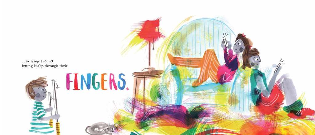
The book deftly shows what it might be like when there’s no time. Could you please select one of your illustrations that shows this and explain what you’ve done?
As well as painting quickly, and making many happy messes on the page, composition was very important. There are some pages in Timeless where characters are cropped in a way that looks as though they’re rushing off the page. These were very deliberate choices, because I wanted the reader to know that these characters were so busy they didn’t even have time to stay on the page for the length of time it took to read it.
How and why have you incorporated greyscale?
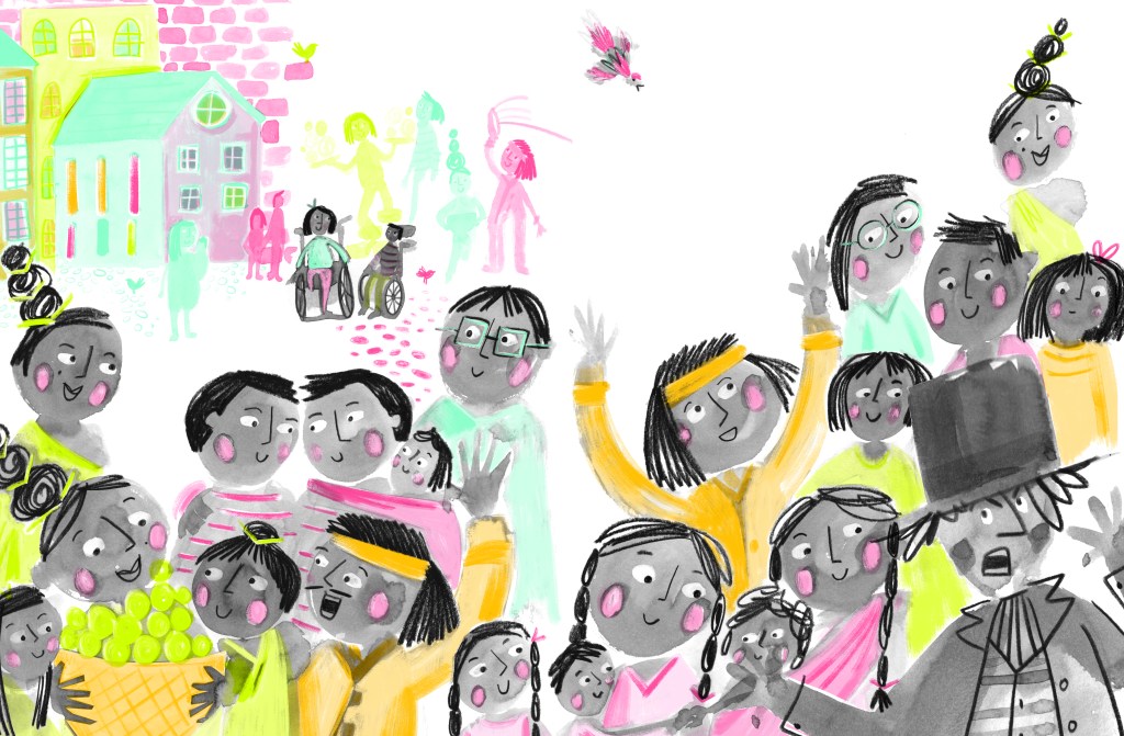
I use grey a lot to add another level to the stories I’m wanting to tell. When I’m illustrating human characters in my own picture books for example, I almost always paint them in grey. The reason for that is to make them universally identifiable and of no specific race. They’re just humans going about their business, and they could be from anywhere in the world. Another book of mine, Littlelight, relies heavily on greyscale to show that while the mayor of the town has created a place that might be ‘safe’ it’s also a place that lacks any interest or excitement or … colour.
What is the saddest part of the book?
Obviously, the fact that not one single person in Emit’s family has a minute to sit and spend time with him is sad. But, to be honest, I’ve never thought any of it was sad until this question. I think because there is a little humour on each page, the book has always felt upbeat to me, despite, or maybe even in spite, of the subject matter.
And the happiest?
Probably that Emit, as an adult, was aware enough to know and decide that he wasn’t going to repeat the mistakes of the past. Happy … and deep!
Apart from the puns, how have you shown humour in the book?
I would like to think there’s some humour hidden in the illustrations but, to be honest, it’s hard to know what other people will find funny. I write and draw what makes me chuckle and hope that readers share my sense, and love, of the ridiculous.
Please tell us about some of the books in your impressive backlist, possibly also to show comparison (particularly illustration-wise) with Timeless.
I’ve published four other picture books in Australia with Fremantle Press: The Hole Story, Littlelight, Rodney and A Leaf Called Greaf. All of them centre around my joy of puns and word play and looking at a subject from another point of view. What changes with each book is usually the medium used to create the illustrations and, to a small degree, the style as well.
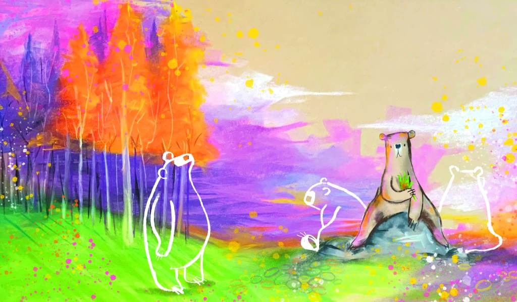
The story will always determine how I approach the illustrations. In my most recent book, A Leaf Called Greaf, the illustrations were created using soft pastel and are, I think, quiet and still. I created big landscapes with a small bear to show how alone he felt in his surroundings. With Littlelight, I used grayscale with pops of very bright neon spot colour for everything outside of the town’s walls to show that what was happening out there was bright and alive and exciting. Timeless was painted in ink with quick brush strokes to show the busy-ness of the people in the book.
The wonderful thing about being both the author and the illustrator is that my books, right up until they go to print, are constantly and continually evolving. It’s a dance, and my words and illustrations have to move and work together or the book doesn’t work.
What impact has Timeless being recognised as a CBCA Picture Book of the Year had on you or this book?
Recognition is encouragement; it’s being told that you are on the right track and that you should keep doing this thing you love because your work is touching people in a positive way. I would still work and make art and write books without the recognition and encouragement because it’s what I do, but possibly I wouldn’t be quite so brave with some of my decision making. A sticker on your book lets you know you were right to make a few brave moves and so, with the next book, you have the confidence to make a few more.


2 thoughts on “Timeless by Kelly Canby”