Emma Quay talks about the way she captures movement in her illustrations.
Images used are from Happy All Over, written & illustrated by Emma Quay
Published by HarperCollins
This is an exceptional piece by Emma.
Students (and masters!) of art and illustration should use this as a ‘how-to-illustrate-movement’ guide and inspiration.
Thank you for inviting me to write about my illustration practice, Joy. If I’m completely honest, it involves a lot of sitting and looking, a fair amount of sitting and thinking and slightly less sitting and drawing — all of which have one thing in common! So, it’s perhaps ironic that the subject about which I receive more messages than any other is movement.
So, I’ll make that my focus: the movement in my illustrations.
I suppose that seems like a funny thing to say, when the surface of the printed page is essentially two-dimensional and on it illustrations and type alike lie completely still in a thin slick of ink — and yet we often describe lines as ‘energetic’, artwork as ‘dynamic’, patterns as ‘rhythmic’. Much of the work of reading those marks as representing motion happens in the mind of the reader, but as an illustrator I do attempt a gentle steering of that interpretation.
I think my illustrations might have movement in them because they once didn’t. Confusing? I’ll explain!
In the first year of my Graphic Design degree, we were finally given a picture book illustration brief, and — joy! — it was to illustrate a scene from Alice’s Adventures in Wonderland (a childhood favourite of mine). I threw myself into it, scratching out a long-haired, slightly morose post-cake Alice cramped onto the page, using a dip pen and ink. At the end of the assignment, our artworks were pinned up for comment and a vote. Mine was doing well in the peer critique, until our tutor agreed that my illustration was appealing, but was it perhaps a bit static? He was right. And at that moment I resolved never to give anyone reason to say that again!
So, the injection of movement into picture book illustration is a subject to which I’ve paid particular attention since my teens.
Much of the time, the laws of the physical world lend a hand: what goes up must come down, to will become fro! But there are intentional devices at play in most of my drawings, and I’ll attempt to articulate a few of them.
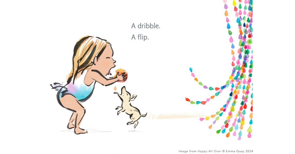
One of the simplest ways I feel movement can be implied is by capturing a character mid-gesture — frozen in a moment — but making sure it’s one that suggests the moments that came before and what will follow. Here — because she’s biting into a very juicy peach — a girl juts her chin forward to avoid sticky splashes and a dog rushes to catch a falling drip. We see a smudge of colour behind the dog, suggesting eagerness, speed and the direction from which he has come. The beaded curtain at the door flips up in his wake.
The image is a simplified version of my original concept, in which I planned to paint multiple blurring limbs to describe the dog in motion— perhaps a little alla Giacomo Balla’s dynamic sausage dog with its blurring ‘centipede’ legs!
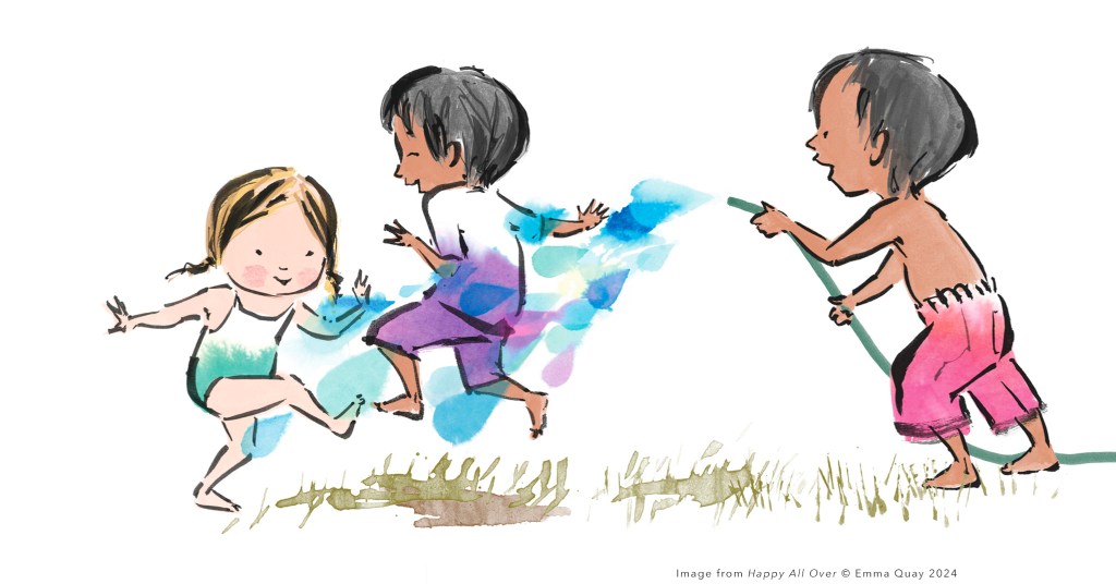
These decisions are not always confined to the characters. Compositional choices can help add movement to an image — strong diagonals, asymmetry, room on a spread for a character’s trajectory to take its course, proximity to the trim lines or even the cropping of illustrative elements, to suggest they might be about to move beyond the confines of the page.
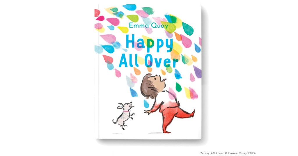
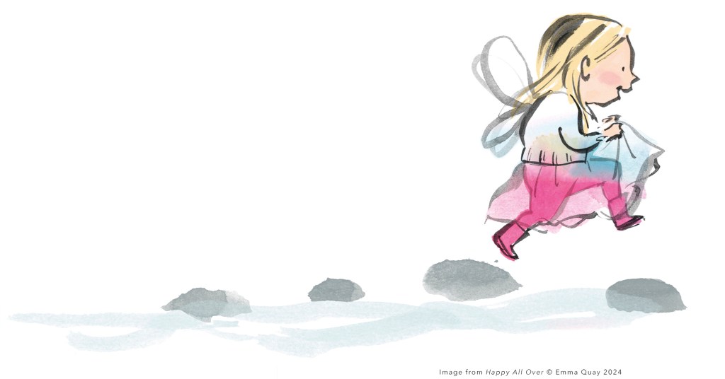
Diagonals famously evoke movement: being neither horizontal nor vertical, they are either just about to slide, roll or fall or are already in motion, and on the cover illustration for Happy All Over the latter is true. I hoped the colourful raindrops might lead the viewer’s eye through the image, ‘reading’ the title and then the little figure, lapping up the attention as he or she marches along.
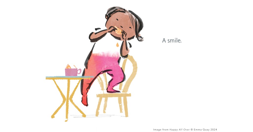
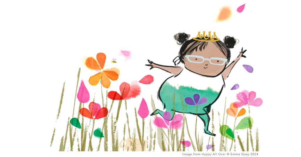
Even when subject matter lends itself to something static — like this girl playing with a slice of orange from her morning snack — I remember that crit at college and try to inject a little movement. Here, instead of drawing the character sitting at the kiddie table, I have her halfway to standing on her chair. You’ll see that slight diagonal, the girl’s weight shifting.
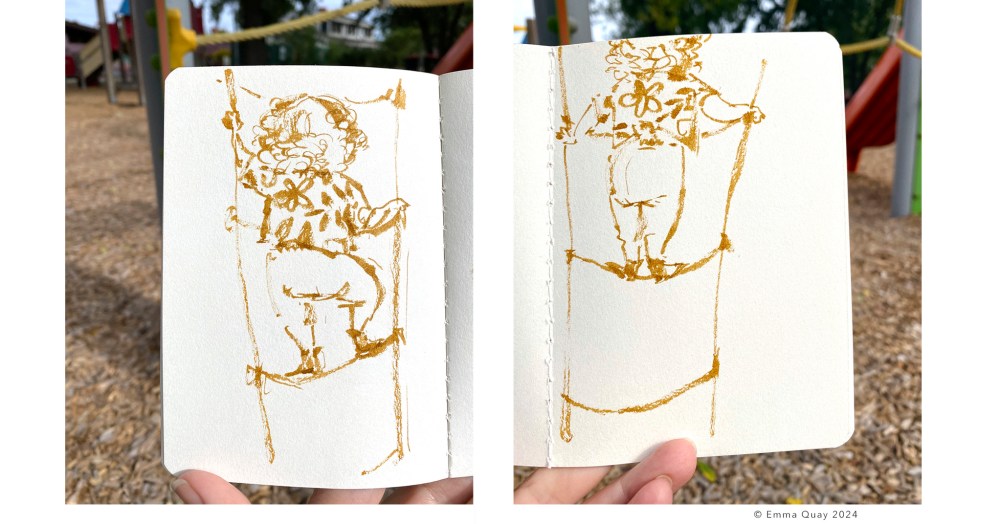
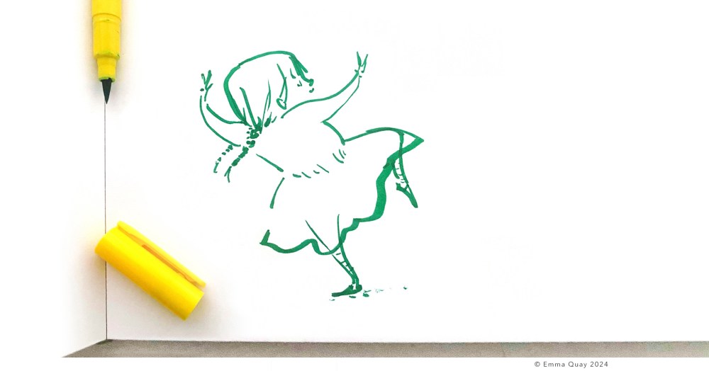
I start each working day with a warm-up — filling a few pages of my sketchbook with children, sometimes from observation at the park and often from my imagination. Over the years, I’ve found myself letting go of any expectations about the outcome and have noticed my drawing practice becoming almost as automatic as handwriting. The lines that make up the figures have become fewer and further apart — they are incomplete, open forms, leaving gaps for the viewer to fill in the details. This sketchiness might perhaps encourage the illusion that a character is not completely glued to the spot on which it is drawn.
As a result of spending a lot of time with art materials over the years, I’m able to hazard a guess at how a paintbrush or pen might respond if I hold it in different ways, apply more or less pressure, load it with various amounts of paint of differing consistencies… even whether I’m sitting or standing can change the dynamic qualities of a mark. Some brush pens need to be whisked along swiftly, or the line will blot. Sometimes this speediness is tangible in the finished image — the tailing-off or flick at the end of a stroke.
If a paintbrush isn’t too drenched, it lets go of less ink as it is dragged across the paper, leaving the parallel striations of its bristles. The ‘air’ in the strokes it makes can suggest movement, seeming less rigid than a solid line.
Sometimes, even though the paint or ink has dried, we can see where it has moved — of its own accord or with guidance — after it has been applied. One colour might bleed into another, dribbles might run down the page, blots might spread. Movement is implied, by accident, or at least seemingly so.
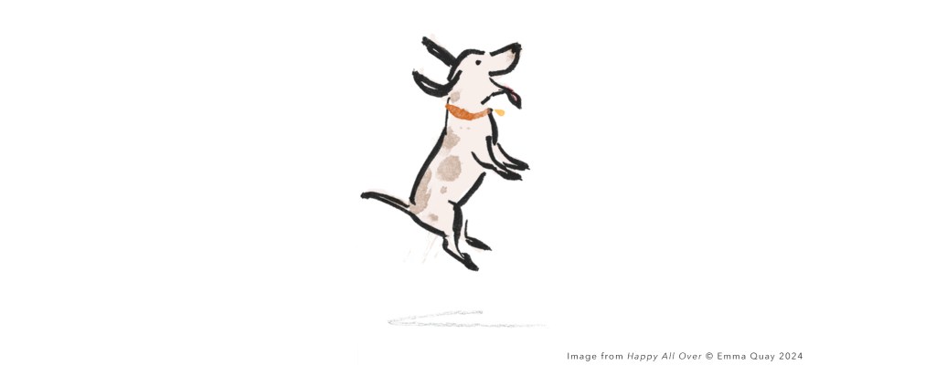
It is almost as if liquid colour is sloshing around inside this boy as he leaps.
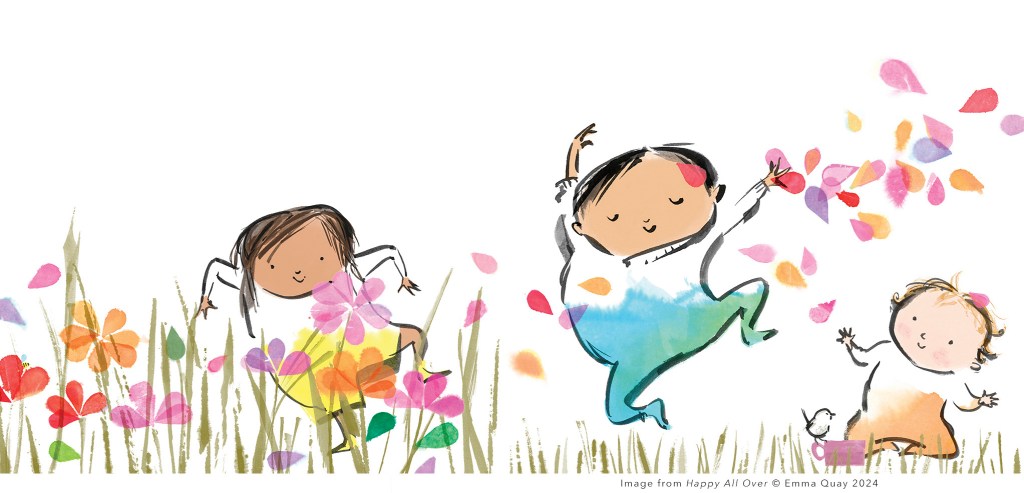
Whisked up and flapping hair, clothing or ears can give us visual clues.
And then there are the parallel ‘parentheses’ that indicate a bounce in comics. I grew up immersed in Peanuts, Whoopee! comic and Whizzer & Chips as much as I did picture books, so the visual iconography of the two art forms became intermingled in my early storytelling and has hung around to this day. An editor early in my career discouraged the use of motion lines in picture book illustrations. I still feel a frisson of rebellion whenever I use a variation on their theme!
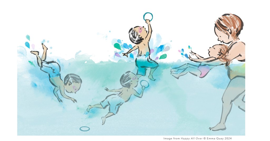
Borrowing another device from the comic strip (or even earlier friezes, tapestries etc.), multiples can describe sequential action within one illustration. I’ve found young children understand there is just one boy diving for the pool toy, here, despite three of him appearing on the page.
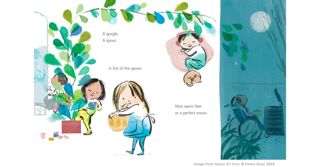
I’m also thinking about where I’d like the reader’s gaze to land and how their eyes might move around the page. To a certain extent this can be guided, partly through grouping of elements and the spaces in between them, contrasts in colour temperature and saturation, tonal value and scale, implied growth or momentum, characters’ eyelines… and even that wooden spoon is playing a part. Sections of text need to be read in the right order, too — the shapes lines and block of type form as well as their placement on the page can guide the way… and I’m careful not to let them get in the way!
Although I strive for my illustrations to retain some of the looseness of free sketching, I’m aware that completely uncontrolled line work or washes of colour can scatter focus, leaving the reader unsure where to look. I try to corral the chaos for the printed page.
And of course, sometimes we don’t seek to imply movement at all. There
might be an intentionally still moment, described with closed shapes, verticals — holding us on the spot for long enough to soak it up.
As I sit and draw, I often find myself beginning to contort myself into the position a character is taking on the page — experiencing a little of their movement with my own body, perhaps to gain a better understanding of how it feels, perhaps because I really need to move more! I’m working on the latter, and you’ll regularly see me at the gym these days… admittedly with one eye on the other patrons, watching the ways they move and storing up dynamic imagery for future illustrations!
This feature article, ‘Still Moving with Emma Quay’ is a companion piece to our in-depth interview in Magpies magazine, May 2024.
