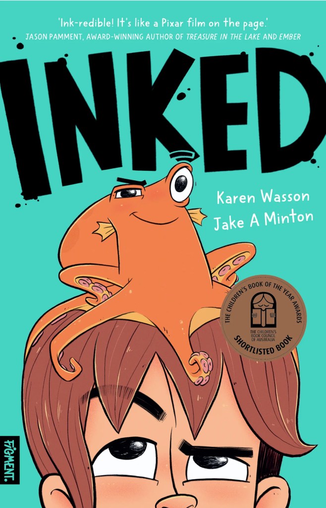
Inked by Karen Wasson,
illustrated Jake A Minton
Published by Figment Books (Hardie Grant Publishing)
“I wish I could blend in.” (Inked)
Inked is a graphic novel shortlisted in the Younger Reader category of the 2026 CBCA awards. It was also the first graphic novel to be shortlisted for the Ampersand Prize for an unpublished manuscript.
Interview with Inked creators Karen Wasson & Jake A. Minton
Thank you for speaking with PaperbarkWords, Karen and Jake.
Congratulations on Inked being CBCA shortlisted. It is a perfect combination of story with interwoven issues and superb illustrations in a graphic novel format. Young readers will love it.
Where are you both based and what is your background in books?
KW: I’m based in the SE suburbs of Melbourne on lands belonging to the Boonwurrung people of the Kulin Nation.
I am and always have been a great lover of books, however it wasn’t until after my youngest child (of three) started school that I looked at pursuing writing seriously. Previously I worked in Film and Television production!
JM: I’m based in Melbourne’s inner west, although during the creation of Inked I was living in Bangalow up in the Northern Rivers. A lot of that landscape definitely made its way into the illustrations of Inked.
I had been travelling for many years, working odd jobs and getting illustration gigs where I could, having a grand old time. Then covid hit and I was locked down in Melbourne for months. During that time, I decided to take things a bit more seriously and really focus on picture book illustration. Been lucky enough to be working in this great industry ever since.
Inked is a brilliant title. To what does it allude?
KW: So glad you like it! It does have a double meaning. Referring to the ink of an octopus / Otto and the fact that Sid draws and uses ink in his artworks!
Could you describe the relationship between Sid and Otto?
KW: Sid and Otto are certainly not the best of friends, their relationship is really one of symbiosis! Sid needs Otto to help him get to art school and Otto needs Sid to get him to the ocean.
As they have such different personalities, Sid being an introvert and Otto an extrovert, they can’t see why the other wants to live their life the way they do. They also find themselves with a difference of opinion on almost every subject. However once they start to understand each other more, they no longer feel they have to help one another, but want to.
What are they both dreaming of and what is hindering them?
KW: Sid is a talented artist who loves drawing and creating. He has been accepted into his dream school, a school catering to the arts. However this wonderful school is also quite expensive and his family can’t afford the fees.
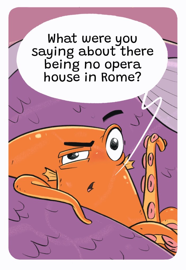
Otto on the other hand has ended up in Sid’s home town of Rone by mistake. His dream was to go to Rome and sing in the great opera houses there. Finding himself 300 kilometers from the ocean, Otto is keen to be off and on his way to stardom.
Apart from Jake’s excellent illustrations, there’s a lot about art and the arts in Inked. Could you explore some of this with us please?
KW: Art and artistic expression have always been important to me. I wanted to tell a story where the arts are not only highly valued, they’re encouraged.
JM: I love how all the characters express themselves through art. Initially we see Sid as the outsider, using his ink drawings as a form of expression, dealing with his angst. But it’s revealed throughout the book that everyone has their own artistic passion that they keep close to their hearts. There’s this unspoken, creative unity that really bridges the gaps between the characters and makes them relate to each other. It’s beautiful and really real I think. Just another one of the many incredible story threads Karen has weaved into this tale.
What are some other themes or issues raised in the book?
KW: There are a number of issues raised in the story. It looks at topics such as; community, connection, bullying and friendship. The story also raises the problems with fast food and unsustainable fishing and the challenges faced by families experiencing dementia.
How do you both incorporate humour through words and pictures?
KW: One of the main reasons I wrote the story as a graphic novel in the first place was because of all the visual humour I desperately wanted to include. Jake and I just seem to be on the same page when it comes to funny. This scene is one of my favourites!
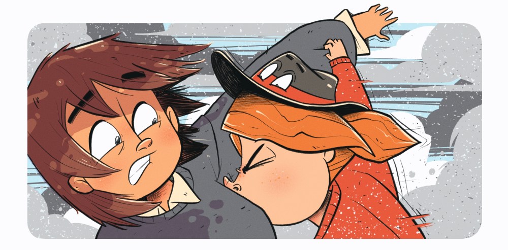
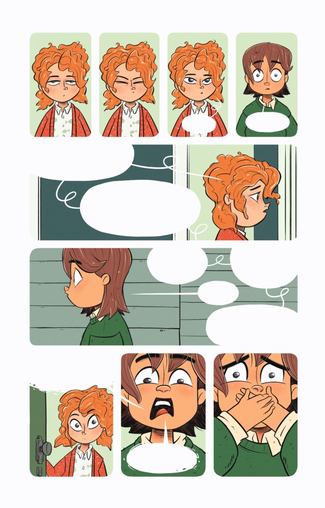
JM: The funniest bit for me is the juxtaposition between Sid and Otto. Otto’s Flamboyant, overzealous outbursts and Sid’s constant attempts to stay unseen create great visual humour. There’s a lot to consider though to really make the humour land. The characters expressions, body language, pacing, timing and perspective all play into it. One of my favourite pages that incorporate these elements beautifully is when Dee opens the door to find Sid, panicked about losing Otto.
Where are how do you build suspense?
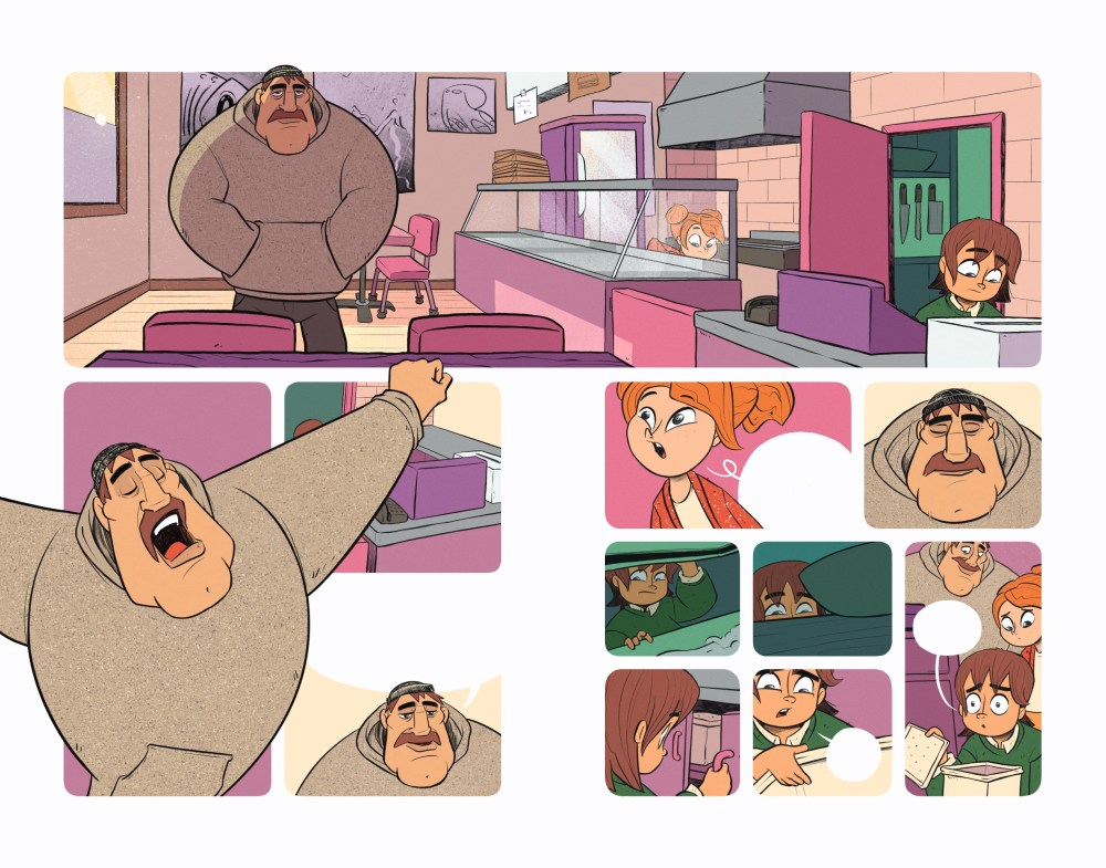
The scene in Crackin Calamari where Sid and Dee are desperately searching for Otto would be a good example of building suspense. This is achieved through upping the number of panels and jumping from face to face with lots of close ups so we can see the anxiety rising in their expressions. The increase in panels creates a bit of an information influx which causes the viewer to read faster and takes them along for the ride. Finally, the urgency of the scene contrasted against Dad’s frustrating lack of awareness puts the icing on the cake
Where and why have you agreed to use wordless spreads?
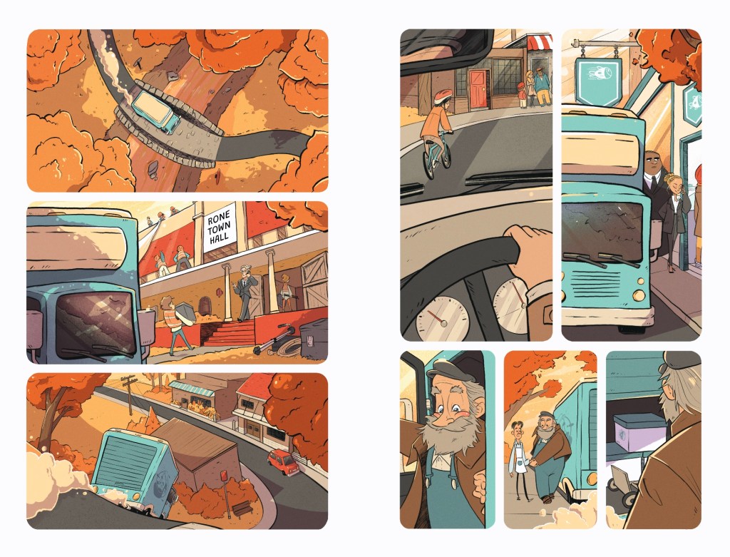
KW: We decided on the cold open in our workshop together with the publisher. It is absolutely brilliant and really paints such a beautiful picture of the town and what’s happening within the community at large. It sets the scene perfectly.
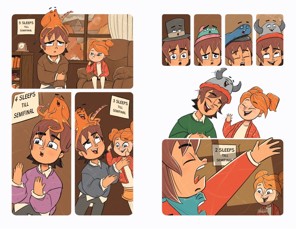
The montage was included because I felt like it was too much of a leap to see Sid and Otto suddenly getting along without the reader seeing their friendship evolving.
What is a favourite example of frame-breaking in the book? Why?
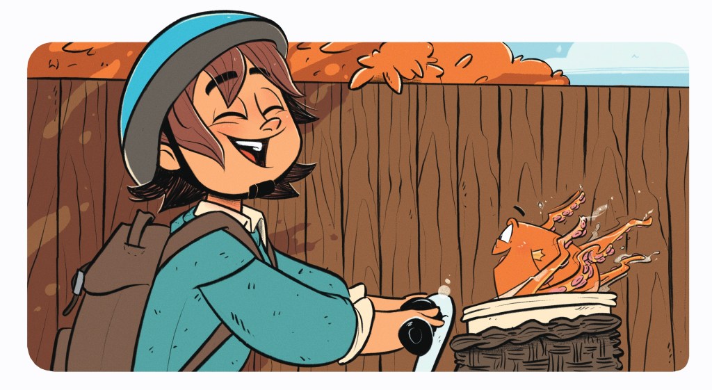
KW: I couldn’t possibly choose a favourite, there are so many fantastic frame-breaking moments! I do love it when Otto nonchalantly spills out and curls around the page because it’s completely his personality. Getting his little suckers into everything like he does!
JM: Mine is on page 197, when we see Sid break the frame for the first time. He has always followed the rules up to this point, but Otto’s lust for life is finally starting to rub off on him.
Jake, your establishing shots throughout the book are a standout. Are these something you particularly enjoy creating? What is a tip about these for aspiring graphic novelists or others?
JM: Thank you so much. I do enjoy creating them, but I actually think they’re the part I find hardest technically. I’m much better at getting into the action and conveying the characters emotions than painting a scene.
As a tip I would say to make sure you’re saying as much about the characters and their situation as you are just setting a location.
Could you talk us through the schoolyard on page 24, for example, including how you used viewpoint, angles, inset panel and anything else?
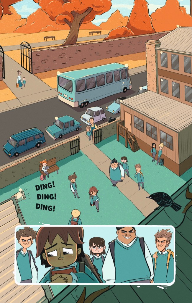
JM: This page is where we first see Sid in the environment where he’s most vulnerable. There’s a very distinct threshold he has passed through when he’s entered that school gate. Everything outside is warm and organic in shape, everything within is cold and angular. Even the shadows are a different colour. Sid is very clearly prey here. Lucas and his friends circle him like sharks, a raven on the roof eyes him, the DING DING DING of the bell seems to be aimed directly at Sid. The whole composition revolves around him. He’s trapped. We then zoom into the inset panel and see that despite his best efforts to be small and in the shadows, he is being hunted.
Jake, how have you made your colour palettes distinctive?
JM: I decided very early on that Sid’s character design would be based off an octopus. Everything visually that followed is basically an extension of that symbol.
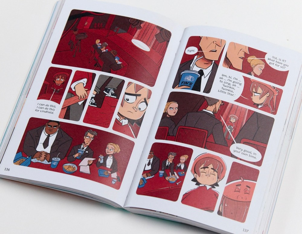
The colour palettes played a massive part in this. When Sid is safe in his fish shop, he’s surrounded by coral colours. A happy octopus in his reef. His home is wooden with splashes of coral, I imagine a cosy little sunken ship. The school is all blues and teals, like the open ocean to showcase his vulnerability. The red of the Show Us What You Got audition symbolises the feeding frenzy these three producers (based on orcas) have been dishing out and so on. Little tid bit about the colour red throughout the book. Every time Sid is about to get bullied by the Lucas and his friends (based on sharks) he has a little bit of red on him or surrounding him. This symbolises that there’s ‘blood in the water’ and the sharks are honing in on their prey
What is a technical difficulty that either of you had to overcome while working on the book?
KW: From my perspective, I feel like we negated any hugely problematic technical issues by meeting up with the publisher and workshopping the manuscript and storyboard together. Jake had begun storyboarding when we had the workshop and it was clear it would have been useful earlier on. So for our next book, we’re workshopping before storyboarding begins!
JM: Mostly just the sheer amount of work. I obviously knew it was going to be a lot of drawing, but I really didn’t quite grasp just how much. There were more than a few 90 hour weeks and sometimes my arm just stopped working. All for the love of the game.
Why do you think a trend is developing where more graphic novels for children are being shortlisted by the CBCA?
KW: Firstly I have to say it’s a fantastic trend! It’s clear that we are becoming more aware of just how much graphic novels have to offer not just young readers but all readers;
- They engage readers who might otherwise be overwhelmed by text-heavy books, making reading more accessible
- They build comprehension and critical thinking
- They are an escape that get kids reading
- And they’re blooming well brilliant!
What impact has being a shortlisted CBCA book had on you or the book so far?
KW: It has been so exciting being shortlisted for the CBCA book of the year awards. I still don’t quite believe it. It’s very surreal having a book out in the world with my name on it, let alone a shiny sticker on the front of that book!
How would you suggest using Inked in schools?
KW: Jennifer Asha created a wonderful set of teacher notes that are available for free on both Hardie Grant’s and my own website. I also highly recommend checking out the UK podcast; Comic Boom – Comics in Education. The host speaks with creators and educators about using graphic novels in schools generally.
JM: I think a great way to study it might be to approach it similarly to how you’d dissect a film.
Both Karen and Jake are available for school visits!
Inside the 2026 CBCA Shortlist
Inside the 2026 CBCA Notable Books

3 thoughts on “Inked by Karen Wasson, illustrated by Jake A Minton ”