
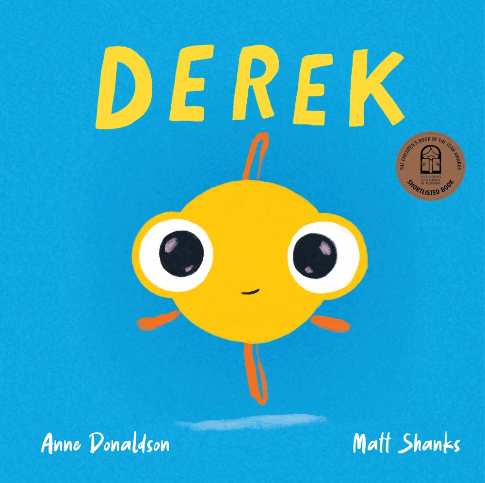
Derek by Anne Donaldson, illustrated by Matt Shanks
(Little Hare, Hardie Grant)
“Derek was a fish with many questions.”
(Derek)
INSIDE THE CBCA 2026 SHORTLIST
Derek is the humorously perceptive Honour-awarded picture book in the Early Childhood category of the 2026 CBCA awards. It is also the Early Childhood Shadow Judging winner.
Interview with Derek creators Anne Donaldson & Matt Shanks
Thank you for speaking with PaperbarkWords, Anne and Matt. You have provided a masterclass in how to create a picture book.
Congratulations on Derek being a CBCA Early Childhood Honour book and Shadow Judging winner.
Where are you both based and what is your background in books?
Matt: I live and work on Boonwurrung/Bunurong land (South East Melbourne). I never had or wasn’t around many books as a kid but I watched a lot of movies. I think I learned most of what I know about visual storytelling because of that (which is now perfect for working as an illustrator.)
Anne: I live and work on Kaurna country in Adelaide.
My background in books – like many creators – comes from an early love of consuming them. I was fortunate to grow up in a house full of books, with free range of the shelves and frequent visits to the library.
Anne, why have you chosen to call the fish (and title) Derek?
Derek was a name which stood out to me as being both a bit quirky and a bit nerdy. There’s an inherent good humour to the name for me. I also like that it’s distinctive. As there aren’t many children of this generation with the name, I hope its rarity makes it memorable.
We did try some other names for the book, but I’m glad that ultimately we went with this focus on Derek. Matt’s cover image makes it a real statement of character.
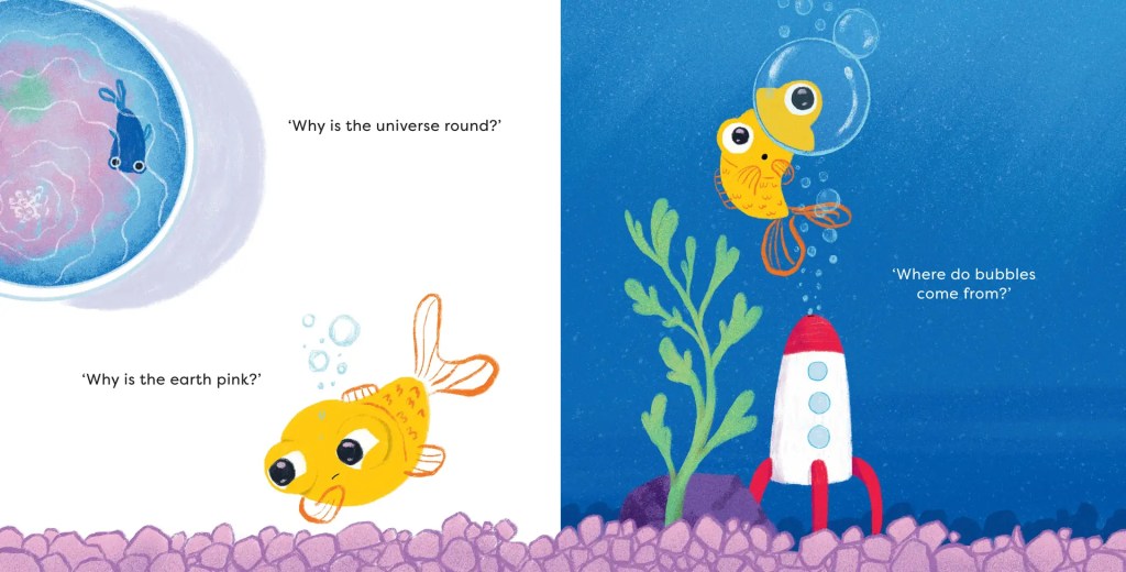
Anne, Derek is a fish with many questions. Could you tell us some of his funny and profound questions? Where there any questions that you had to leave out?
Questions asked by Derek and then later in the book (with the ending twist) include ones which are factual (‘Why is the Earth pink?’), philosophical (‘Where is upside down?’), familiar (‘What’s for dinner?’) and existential (‘Why am I alone?’). Hopefully both adult and child readers will recognise how challenging deceptively simple questions can sometimes be from their own conversations.
There was one question I did wonder whether I would be asked to leave out: ‘Where do babies come from?’ But it stayed in!
Anne, why did you begin the story in past tense?
The use of the past tense for most of the story is the setup for the ending. It allows for a signal that there’s a shift in status when it changes.
What big issues do you tackle – with humour and a light touch – in the story?
Matt: Isolation and community are the obvious ones – Derek’s immediate environment (the plant, the shell, and the rock), aren’t the most responsive to his (our) need for sharing meals or spending time with others (poke poke!).
I think the one that is less obvious is Derek’s resourcefulness and the value of books, literacy and knowledge and how that translates to agency. Derek’s world is quite small, but he dreams big. This is like many children I meet from low socio-economic backgrounds or those who struggle with access to literacy education.
It’s Derek’s interaction with a book that gives him the ability to use his limited resources to enormous effect – to think about his small world differently. Literacy is freedom and connection.

Anne: Loneliness is the key ‘big issue’ that this story tackles. I think being a goldfish makes it less confronting than if it were a story about a person. There’s also enough action that it keeps the emotional mood moving along.
Between the text and Matt’s clever illustrations, there’s also small references to issues like how people sometimes pay more attention to a screen than what is going on around them – so they miss out on connecting, but others may suffer from it too.
What do you think is the source of the humour?
Matt: What’s funny about Derek reading a book in this fish tank is that no one seems to question where the book came from or, if it’s made of paper, how it even works underwater.
Anne: I like humour from readers having a moment of recognition, where they see their own life from a different perspective – such as a child asking if they can get a pet… but the child is a goldfish itself.
There is also a poop joke! Which many kids tell me is their favourite page – enhanced by Matt’s fabulous long poo – so I’m very glad it’s in there.
How do the words and picture interplay to achieve humour?
Matt: The wonderful thing about Anne’s text is the space that exists between the words. For example, the words tell us that Derek is a fish (but not a goldfish) so the illustrations provide additional information. Together, it feels like it couldn’t have been any other way.
Another example – as the story evolved with the pictures it became clear Derek was going to embark on a space-like journey so the ‘really long poo’ drawing was inspired by the idea of orbital rings that we see on many diagrams of space.
How do you build suspense or action?
Matt: One of the best ways to get a tension/release affect in pictures is to vary the point of view and use page turns. The first half of the book builds to an extreme close-up of Derek which helps us build empathy and read his emotions really well. Then, with a single page turn, we put the reader back in the pet shop and ‘outside’ of Derek’s small world and remind the reader how big the ‘actual’ world is and the scale of Derek’s ambition.
Anne: The text uses the rule of three to build both patterns (recognition and prediction) and suspense, with repeated attempts and disappointments.
The attempts start small and build up to a big act of bravery.
What is the clever role of bubbles in the book?
Anne: Bubbles started as a way of setting the world of a goldfish. They are also used in the questioning, to set up the ‘Where do babies come from?’ moment.
Matt took it much further with his use in the illustrations, turning bubbles into a plot element in the action.
What is the significance of the rocket?
Anne: The rocket and space theme were introduced by Matt in his illustrations, he created their own excellent sub-plot.
Matt: The rocket and bubbles kind of go hand in hand. When I was building Derek’s world visually, I felt I needed to solve his own curiosity – where do these bubbles actually come from? When I was a kid, I had a goldfish and we had a treasure chest that made bubbles to aerate the water so I originally drew it like that. But then the bubbles evolved into his own little spacecraft so I changed the origin of those bubbles to give readers a little hint of what may happen in the story. I still managed to squeeze in the treasure chest on the last page as nice subtle way to communicate that Derek found his gold.
Where and why have you agreed to use wordless spreads?
Matt: Derek’s wordless pages were mostly about giving space for the reader to get inside Derek’s thoughts and feelings at key moments. Sometimes, less is more because it forces the reader to engage their own imagination and we enhance projection through that process. Derek’s ‘a-ha’ bubble moment is a favourite one of mine because, when I share this story with a young reader, I feel the penny drop for them just as it does for Derek and they become totally invested in seeing Derek succeed.
Anne: There is an almost wordless spread (there’s a sound effect) because it allows for a change of pace – causing the readers to pause.
This is the moment when Derek’s life literally flips upside down, and the lack of text directs focus onto the illustration, to really see and think about this. It allows the kids to be engaged in figuring out for themselves what’s happening.
How do you show the difference between the worlds inside and outside the fishbowl?
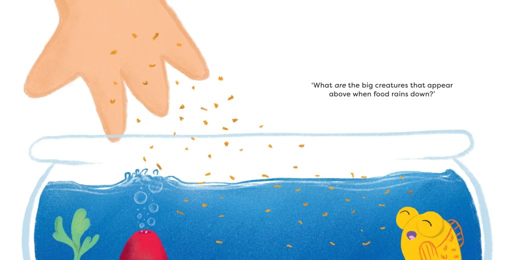
Matt: Colour and size, mostly. When I illustrate a picture book, I’m very much thinking of it like a movie – where should the camera go, what angle should it be and why? Readers know that Derek is a goldfish and they know the size of goldfish in real-life so when Derek takes up a huge amount of space in the image, we intuitively know that it’s not that Derek suddenly became a giant fish, but that we’re close to him. One of the many magical properties of pictures.
Anne: The text never specifies the world outside the fishbowl. The creatures who occupy that world are only mysteriously hinted at, and Derek only moves through that world for one, brief, clear, bright moment.
Matt’s illustrations have brought that other world to life and give the kids a whole other element of the story to discover from close reading of the pictures, including the special endpapers.
Matt, how did you capture Derek’s personality in your illustrations?
When I read the manuscript for the first time, I couldn’t help but feel Derek was full of ‘wide-eyed wonderment’ so that felt important to capture in his design. Whilst facial expressions give us a good sense of personality and feeling, I find that our shared understanding of body language as humans has tremendous ability for conveying personality, so making sure Derek’s curves, body shapes and fins did a lot of the talking was also really important.
Matt, with which example of facial expression or body language are you particularly pleased? Why?
The refraction of Derek’s face in the bubble. I love bringing real physics into books for early readers because it’s also how they experience the world before words. We take it for granted when we experience such distortions in real life (like looking through a glass of water and watching the world bend), but when it’s in a drawing, it gives us a chance to reflect on the world, “Yes, that *does* happen! I just never noticed it before.”
Matt, you’ve used proportion skilfully. What is a favourite example? Why?
I think the spread that contains the extreme close-up of Derek is my favourite. Having those two drawings on facing pages meant we got to help the reader travel around the bowl with Derek. By showing him from behind initially, we completely obscure his expression but, with its facing page, we kind of build a 3D picture in our minds of that first drawing and it helps us imagine the expression on Derek’s face as he’s looking out, even though we can’t physically see it. Magical!
Matt, how have you made your colour palette/s suit the storyline?
I normally use what’s called a colour script to help me plan colours. The first half of the book, when Derek is alone, is a very dark and rich blue; the sort of colour you’d find in a vast, deep ocean (even though it’s only a fishbowl). As Derek dreams we see some quite ‘unrealistic’ colours (like purple), which help us question reality along with him. And towards the end, he ends up in a much more teal/green/bright world. All of these choices had to work alongside the fact that Derek was orange so the environment is often complementary (like blues/greens) or what’s called “analogous”, which is where the purple came from.

Could you tell us something about the book’s endpapers?
Matt: I really appreciate other illustrators who can make really beautiful endpapers – like gorgeous patterns or other visual motifs. My brain can’t helps see it as another opportunity to add a ‘prequel’ or ‘sequel’ to the main story.
What is a technical difficulty that either of you had to overcome while working on the book?
Matt: Derek was my first digital work. I normally use watercolour and pencil and other traditional media but the manuscript (and Derek) seemed to demand some punchy, bright, and saturated colours so I took the plunge and learned a whole bunch of technical image making techniques using Procreate and Photoshop.
Anne: This is my first book published, so the process of working with publishers and designers and an illustrator was all new to me. There were challenges in understanding what the talented team working on this book were trying to achieve (with their considerable experience) and to be able to adapt the writing and pagination to meet those needs, while still keeping the story true to Derek.
What impact has being a shortlisted CBCA book had on you or the book so far?
Matt: I can never get over how creative carers, parents, and readers are with their costumes and other ways they celebrate books and characters. All I do is draw them (and that seems like the easy bit because I don’t have to make them in real-life!!).
Anne: It’s fabulous to see and hear the book being used in school libraries. Shadow Judging activities that educators have used mean the kids have really engaged closely with the book, and it’s amazing to see what they’ve produced from it.

How would you suggest using Derek in schools?
Matt: Lean into our readers’ natural curiosity and be open to follow the threads they want to pull on. What questions or experiences does the story bring up for readers? How do they relate or not relate to Derek’s desire to find connection or answer life’s big questions.
Anne: The premise of a fish with many questions gives an opening for enquiry-based learning, either from some of the questions in the book, or from ones the children themselves may have about the book.
There’s also opportunities to have conversations about loneliness and empowerment (what actions we can take within our own realms).
Matt’s fabulous illustrations also lend themselves to crafting your own fish or even recreating the scenes in a bowl.
Joy Lawn, in association with Dmcprmedia
Derek at Little Hare (Hardie Grant)
Matt Shanks at PaperbarkWords blog


2 thoughts on “Derek by Anne Donaldson, illustrated by Matt Shanks ”